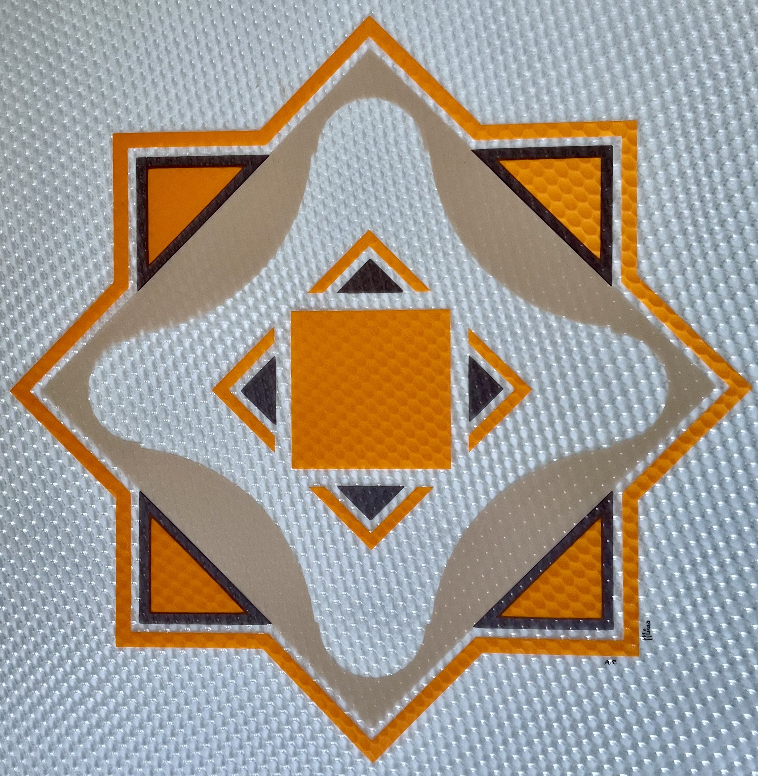
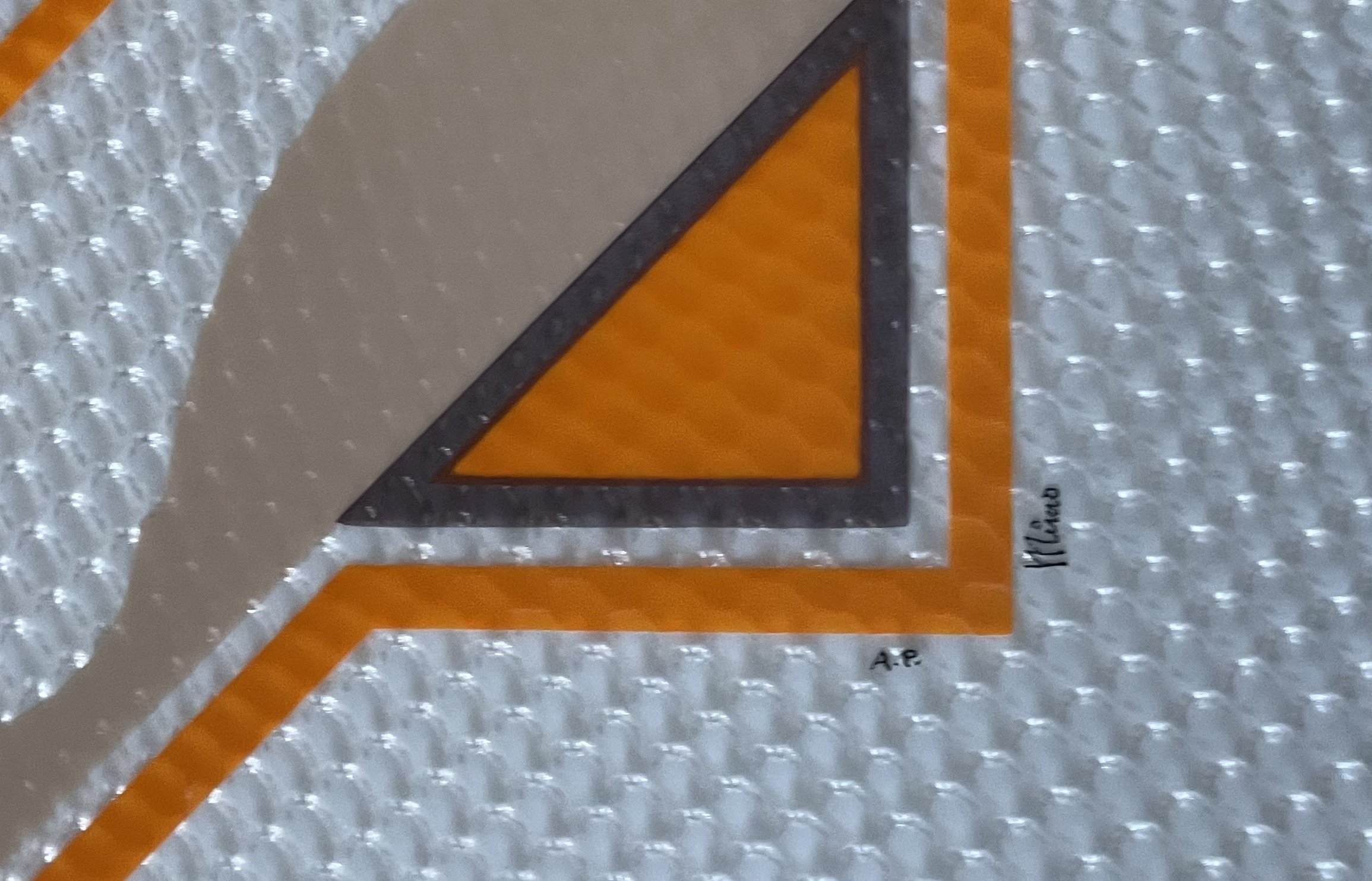
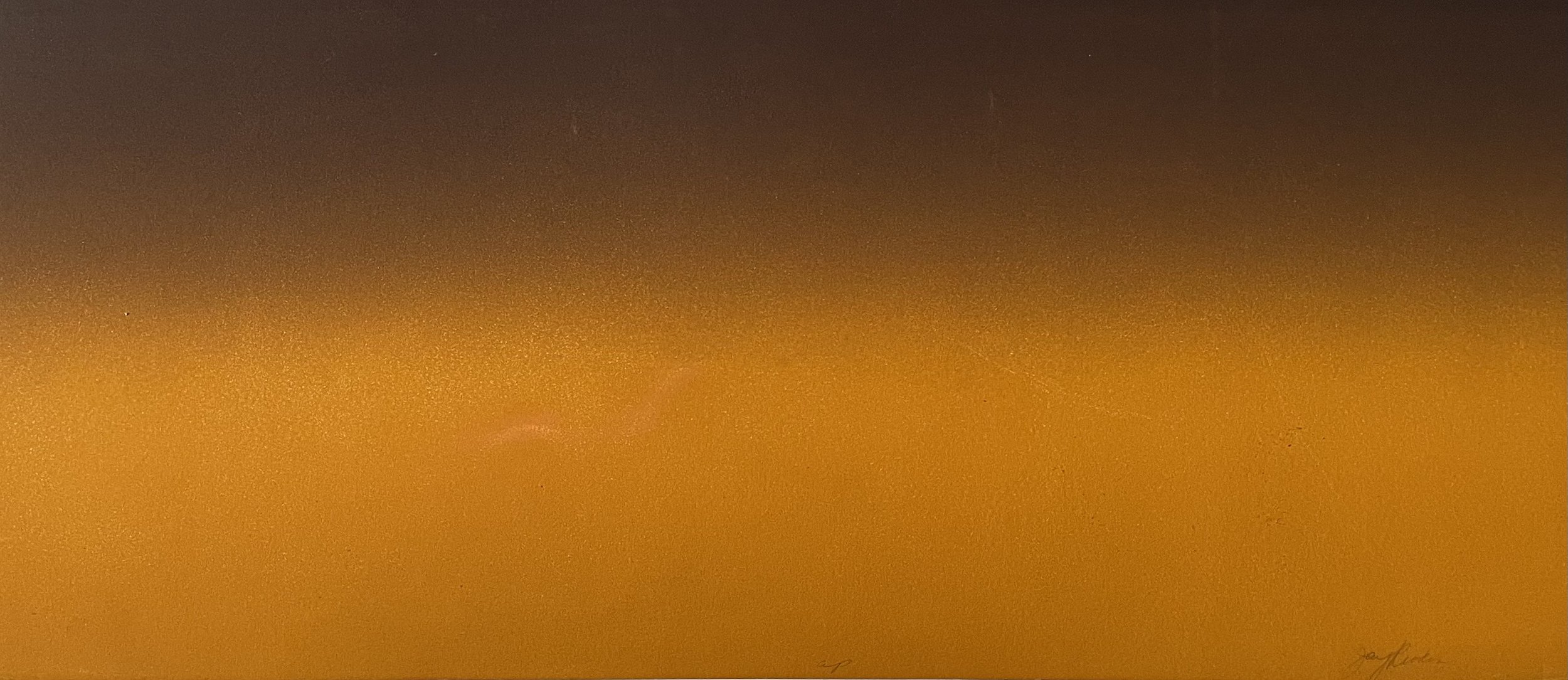
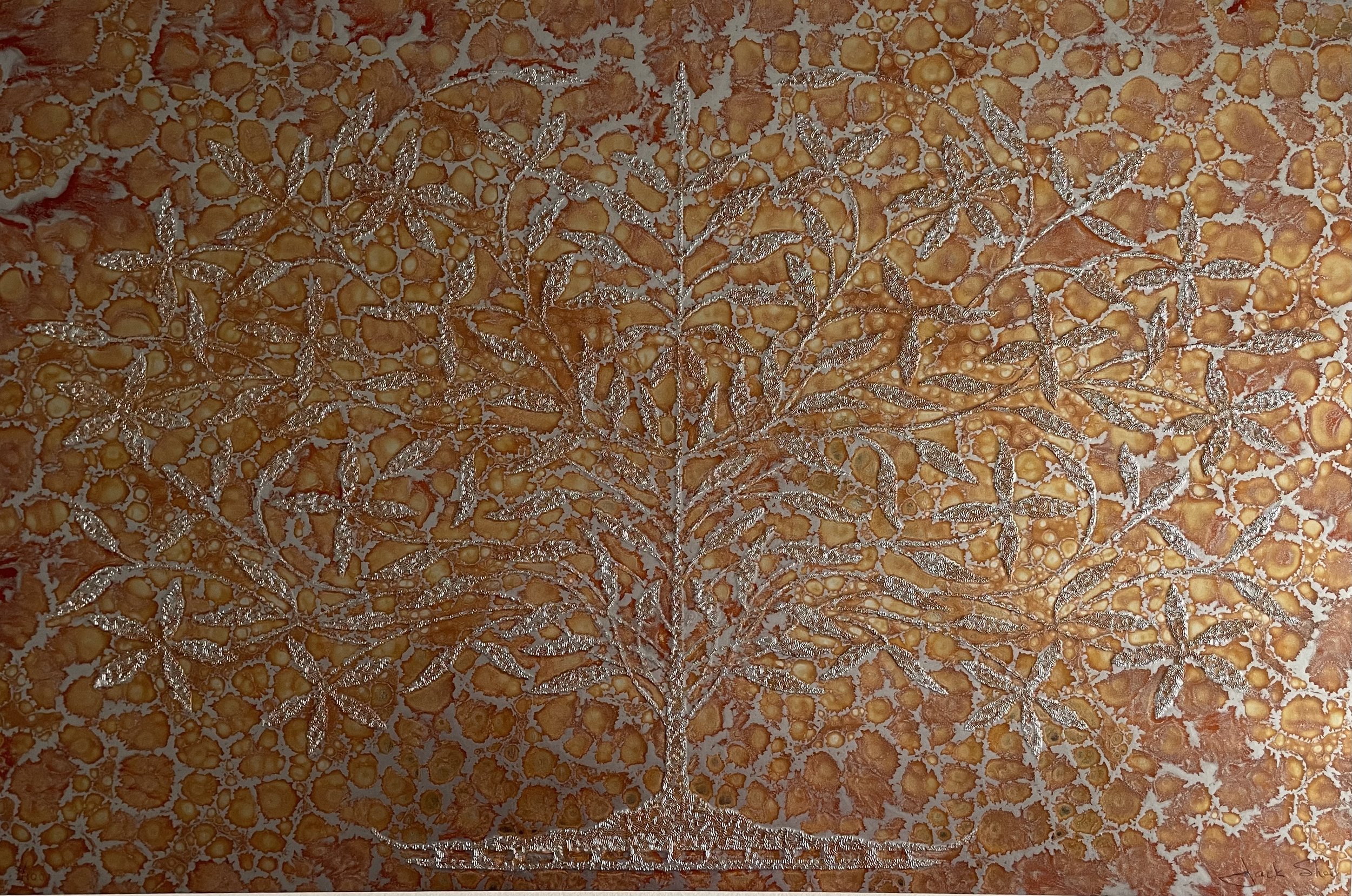
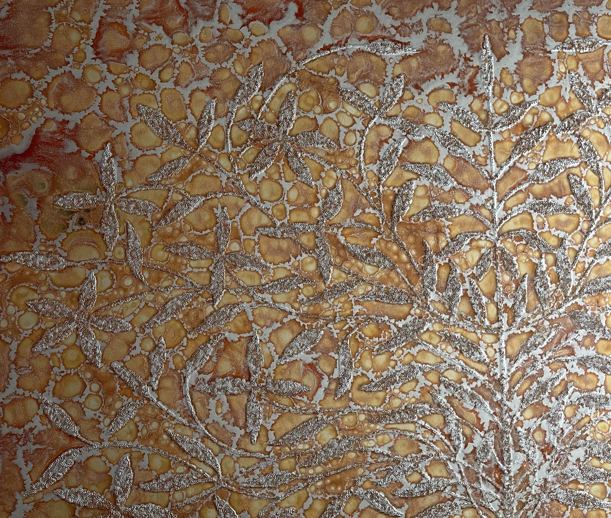
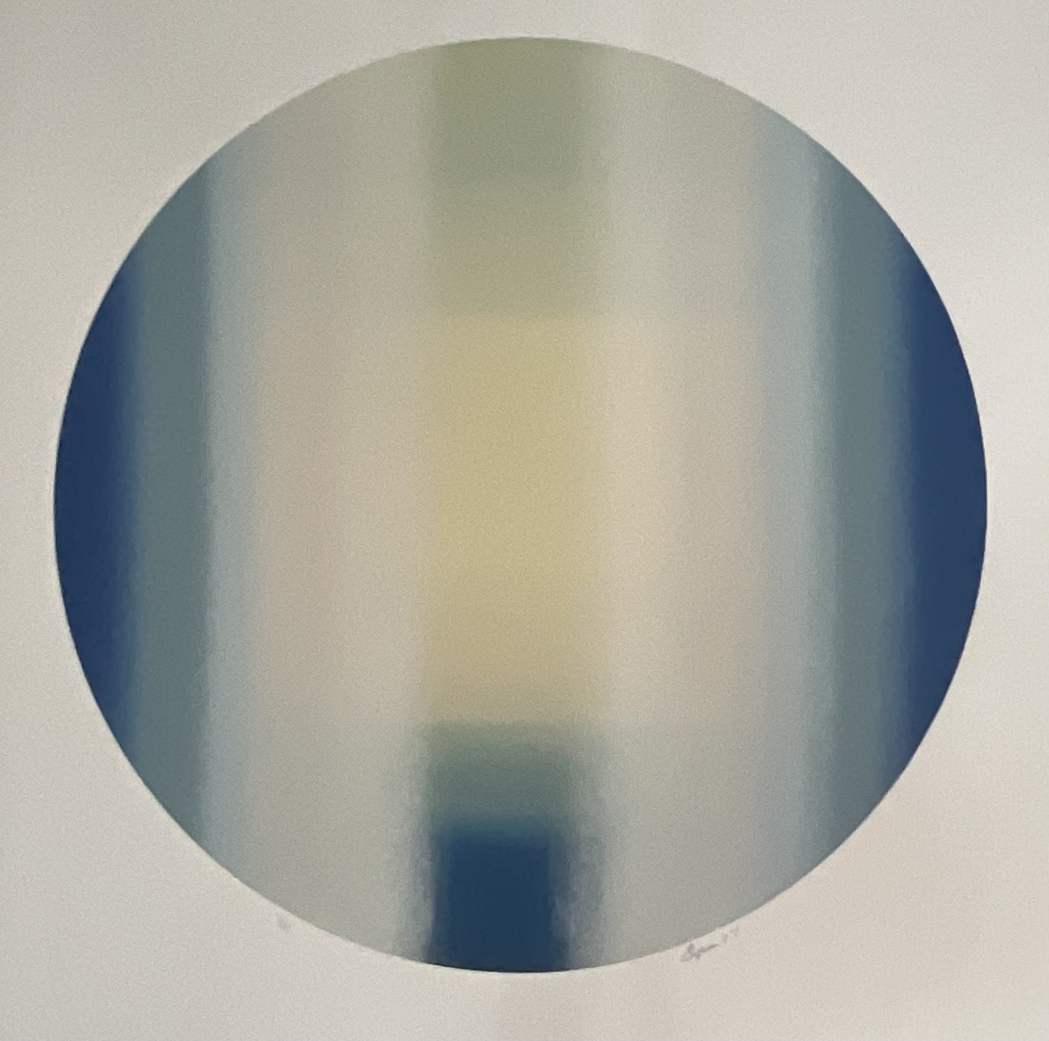
A rare 1970s geometric serigraph by Mimo, screen-printed on textured prismatic vinyl. This Artist’s Proof (A.P.) combines hard-edge abstraction, Op Art precision, and reflective optical surface effects, making it a striking example of modernist decorative printmaking from the era.
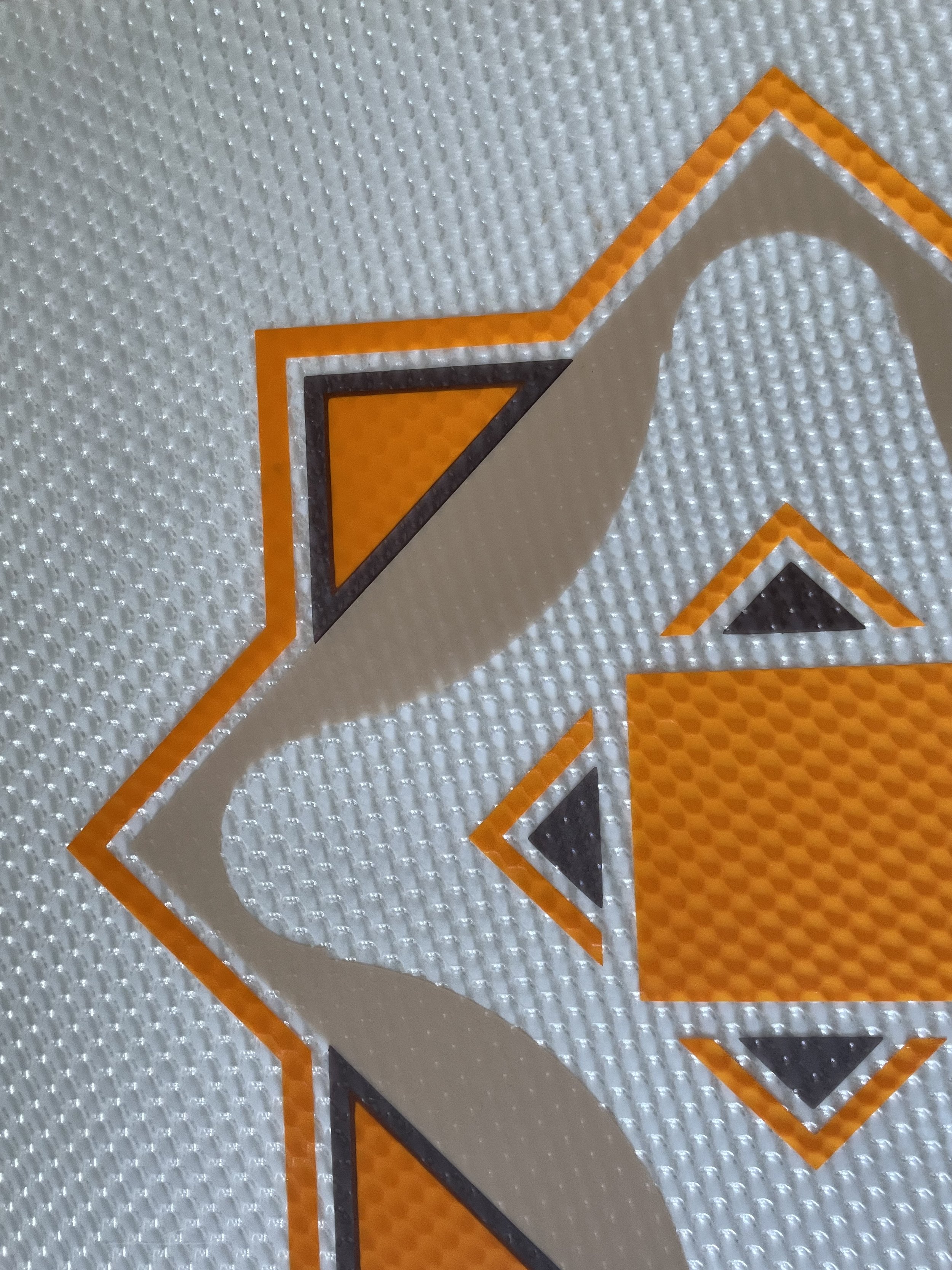
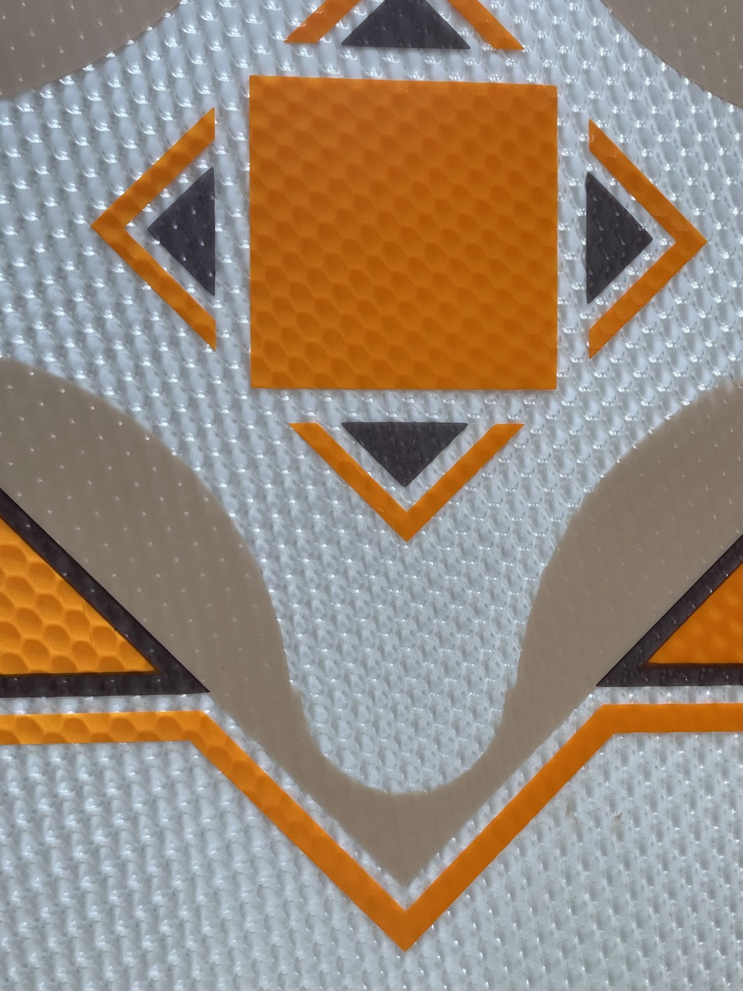
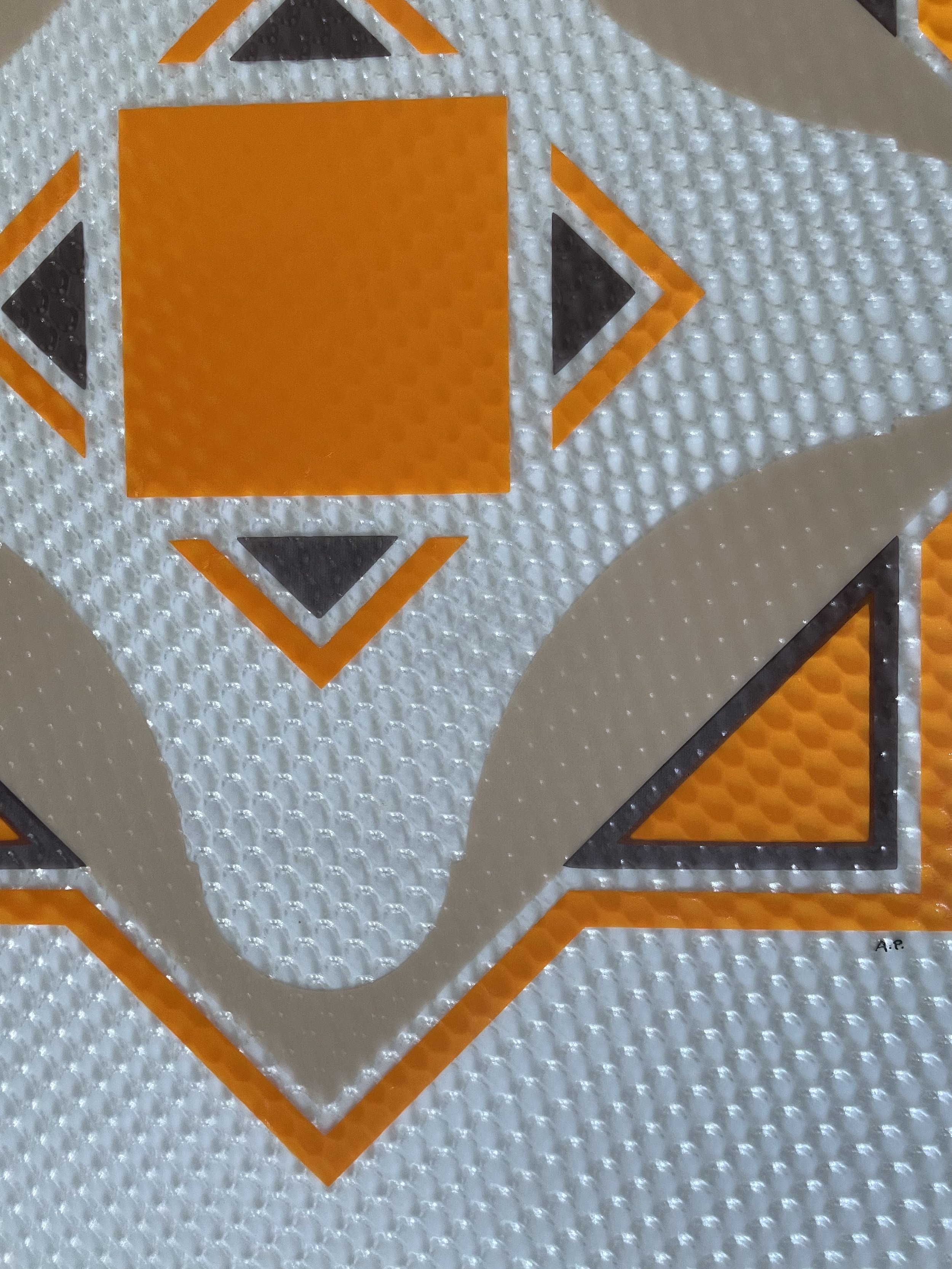
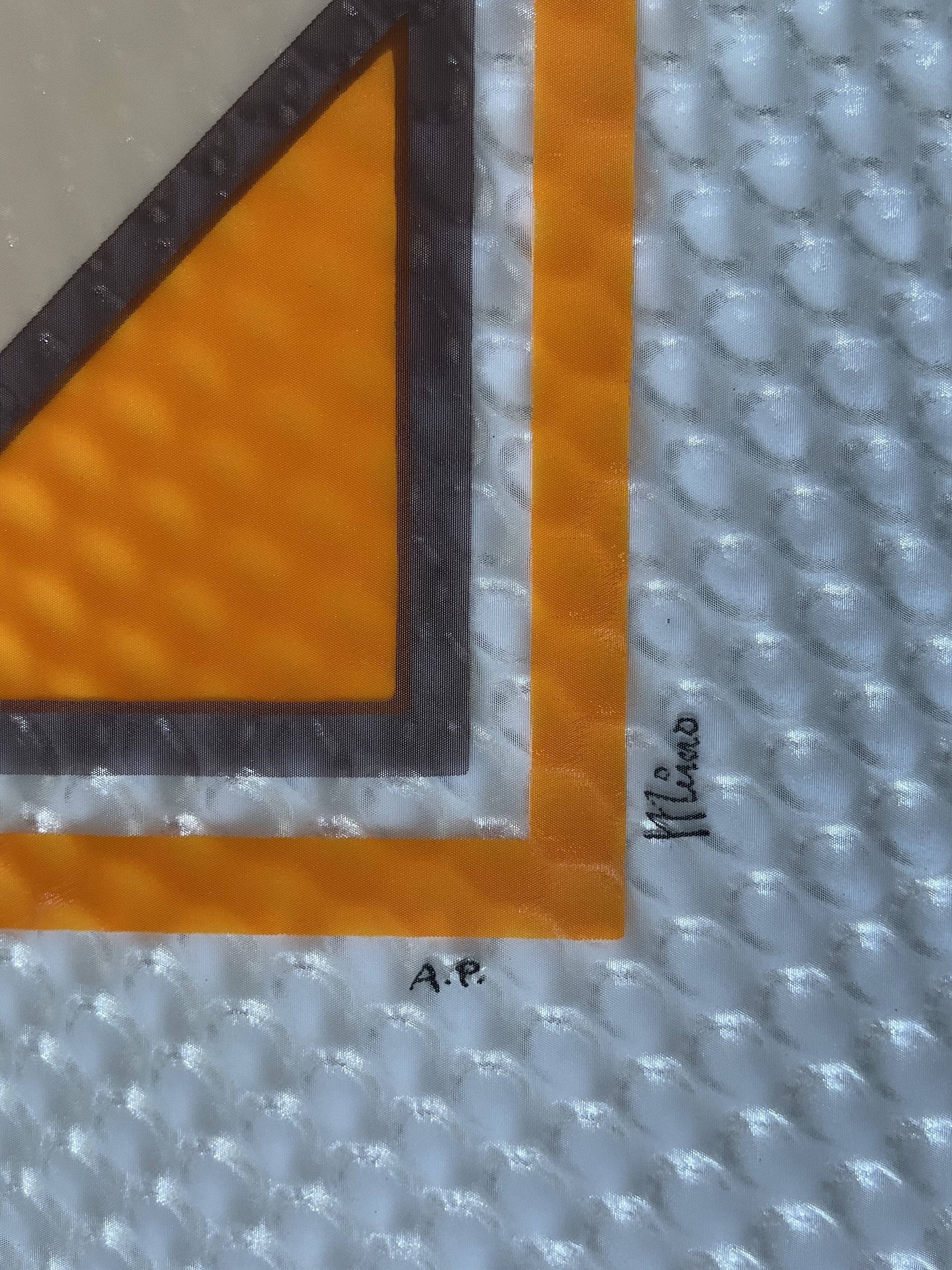
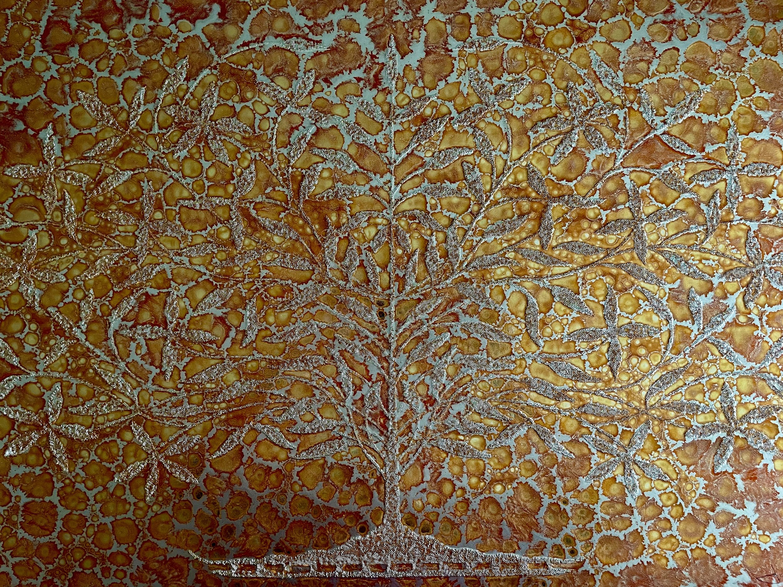
This visually arresting geometric abstraction is structured around a symmetrical, diamond-oriented framework. A central orange square anchors the composition, surrounded by four dark triangular forms that point inward, while sweeping gray arcs create a dynamic rotational rhythm. These elements are contained within layered angular borders rendered in orange, charcoal, and silver-gray, emphasizing balance, order, and architectural clarity.
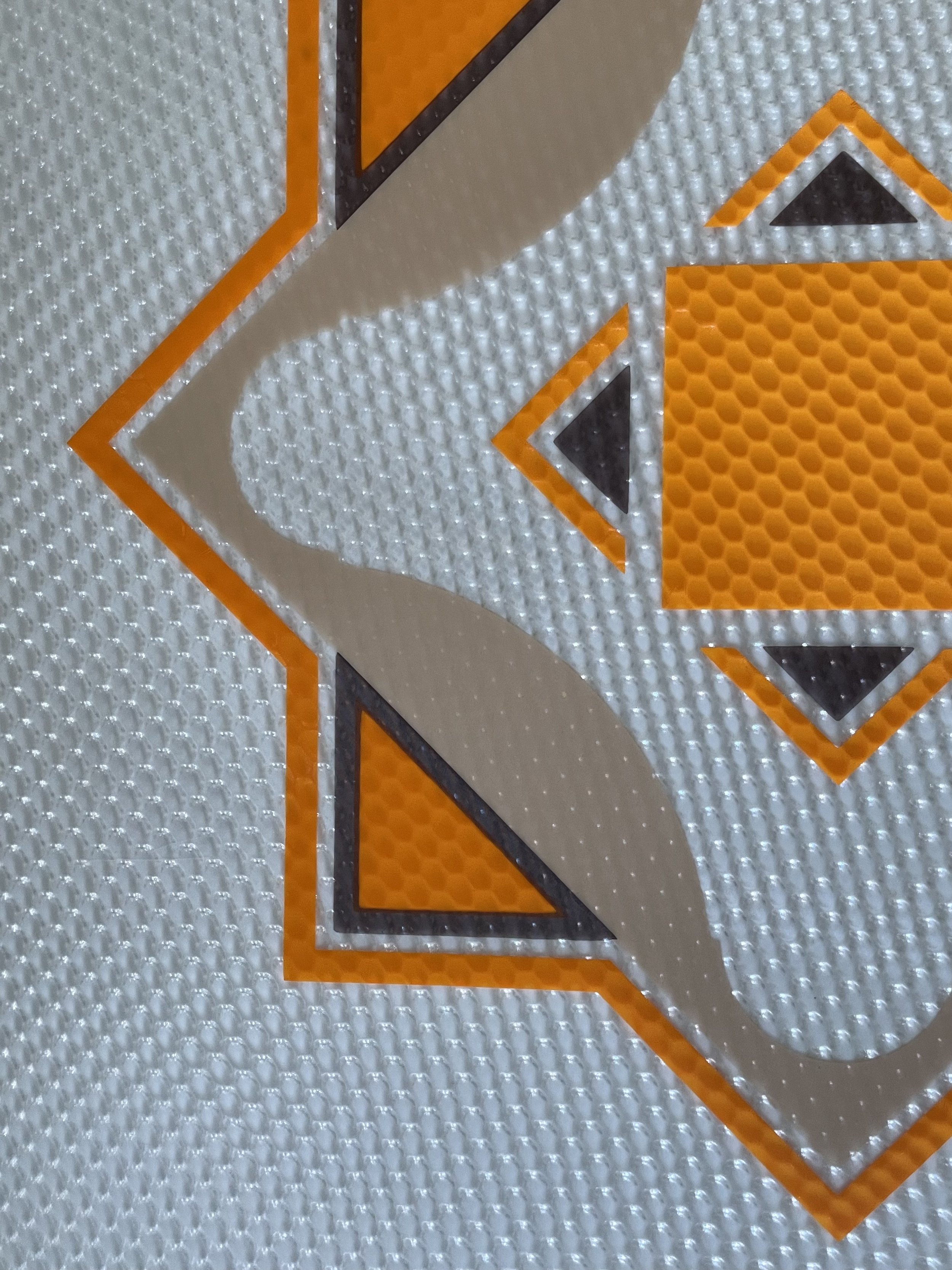
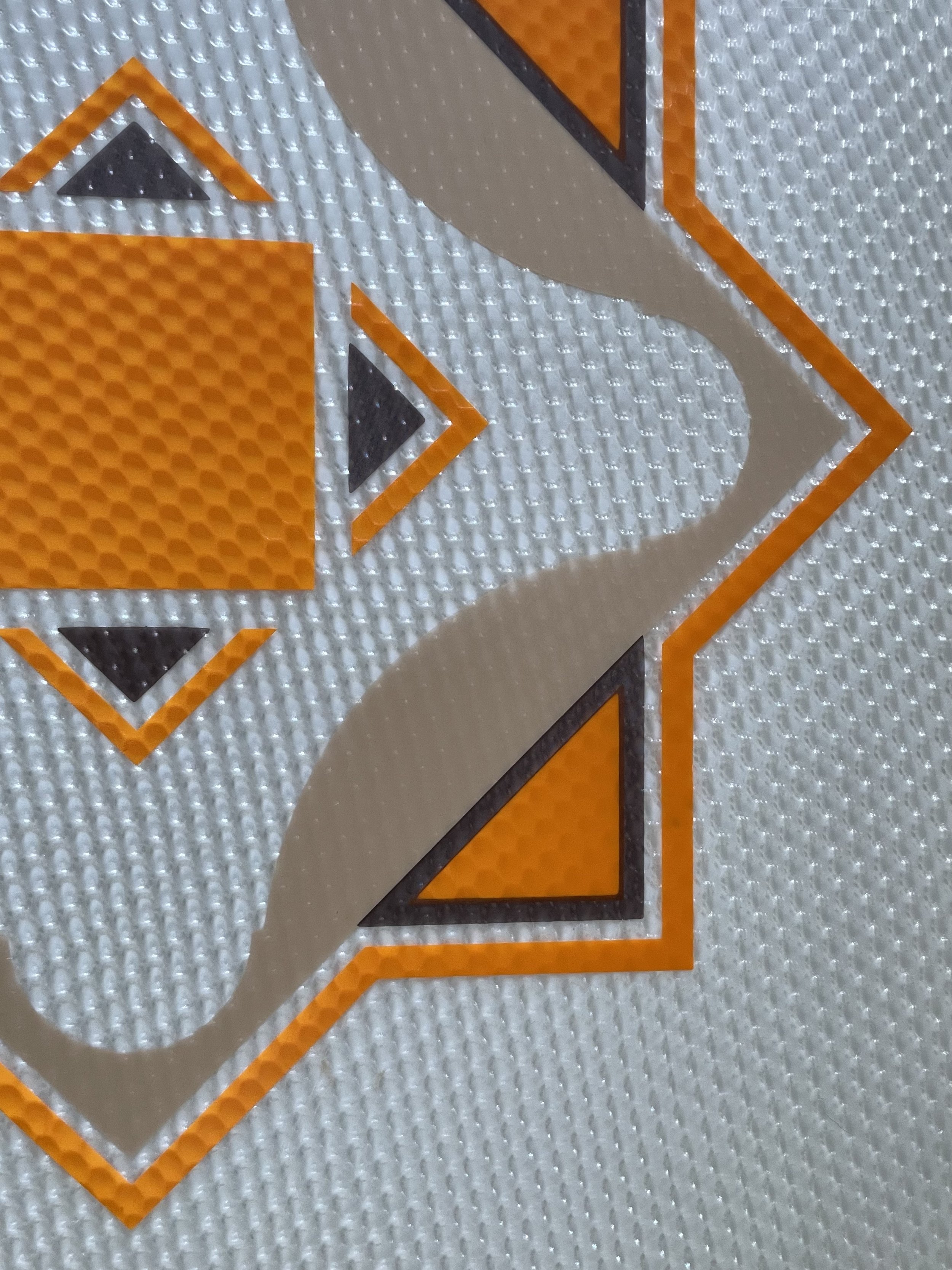
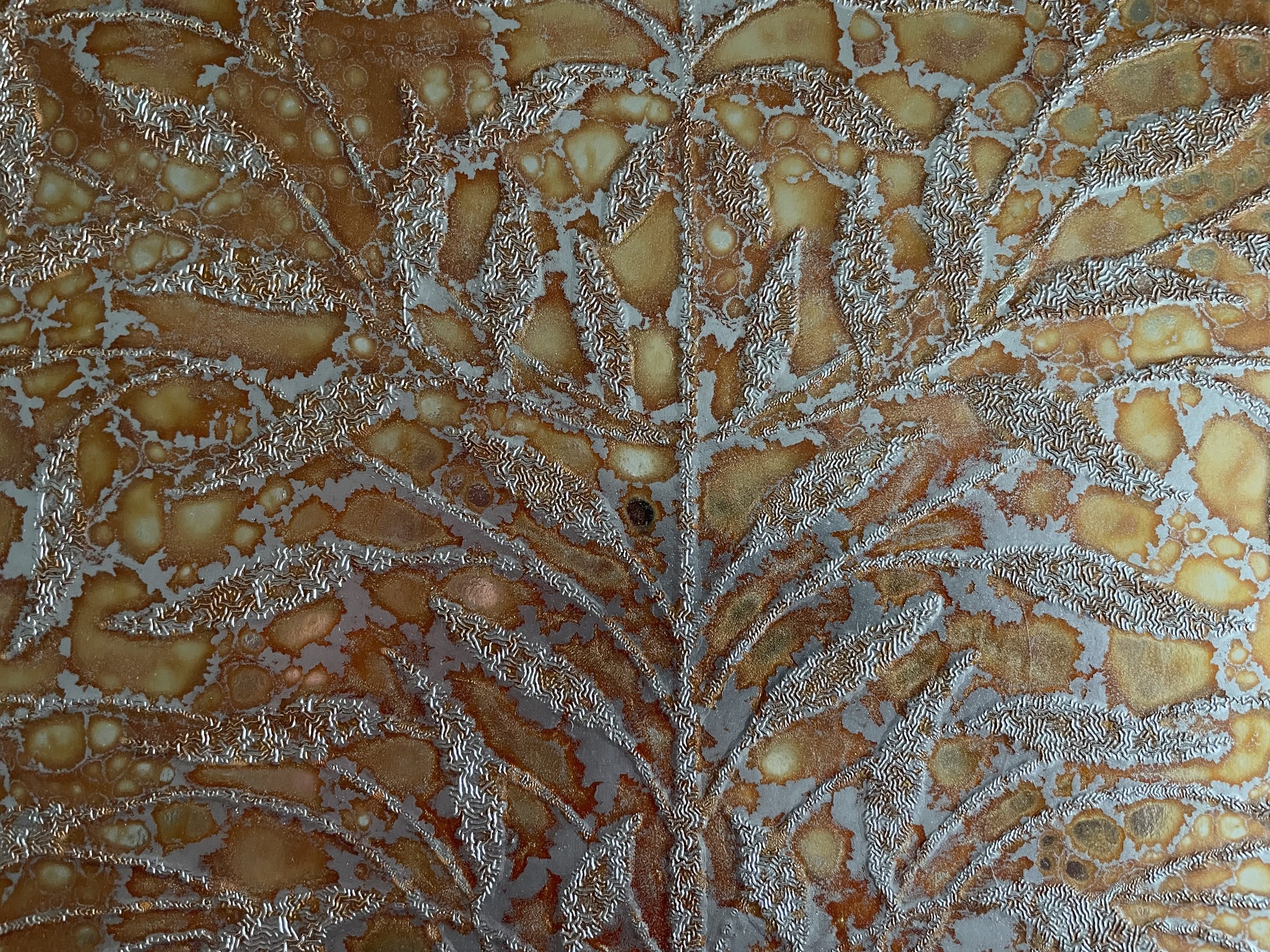
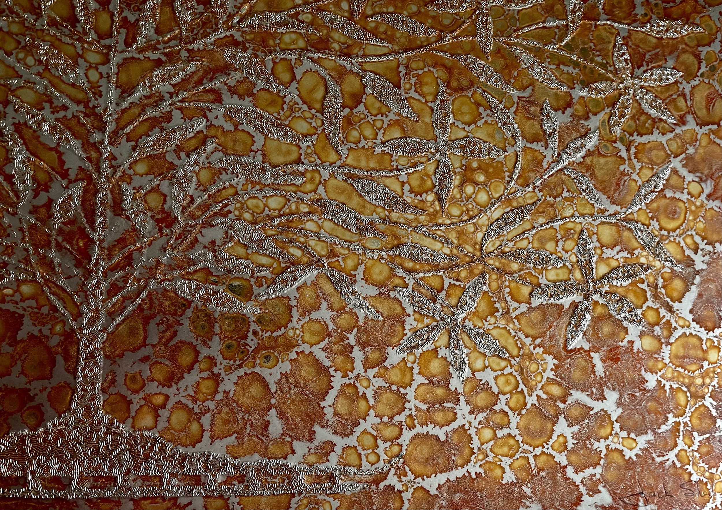
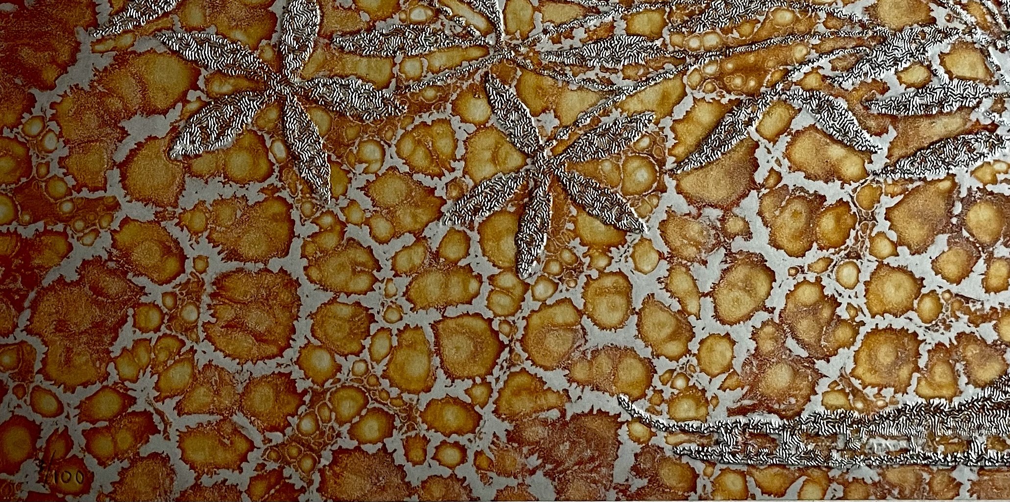
The defining feature of the work is its prismatic vinyl substrate—a textured, light-reactive surface that refracts and scatters light. As the viewer moves, the background shifts subtly in tone and brightness, activating the composition and giving the otherwise flat geometry a kinetic, dimensional quality. This interaction between ink and industrial material places the work squarely within the experimental spirit of 1970s printmaking, when artists increasingly explored nontraditional supports.
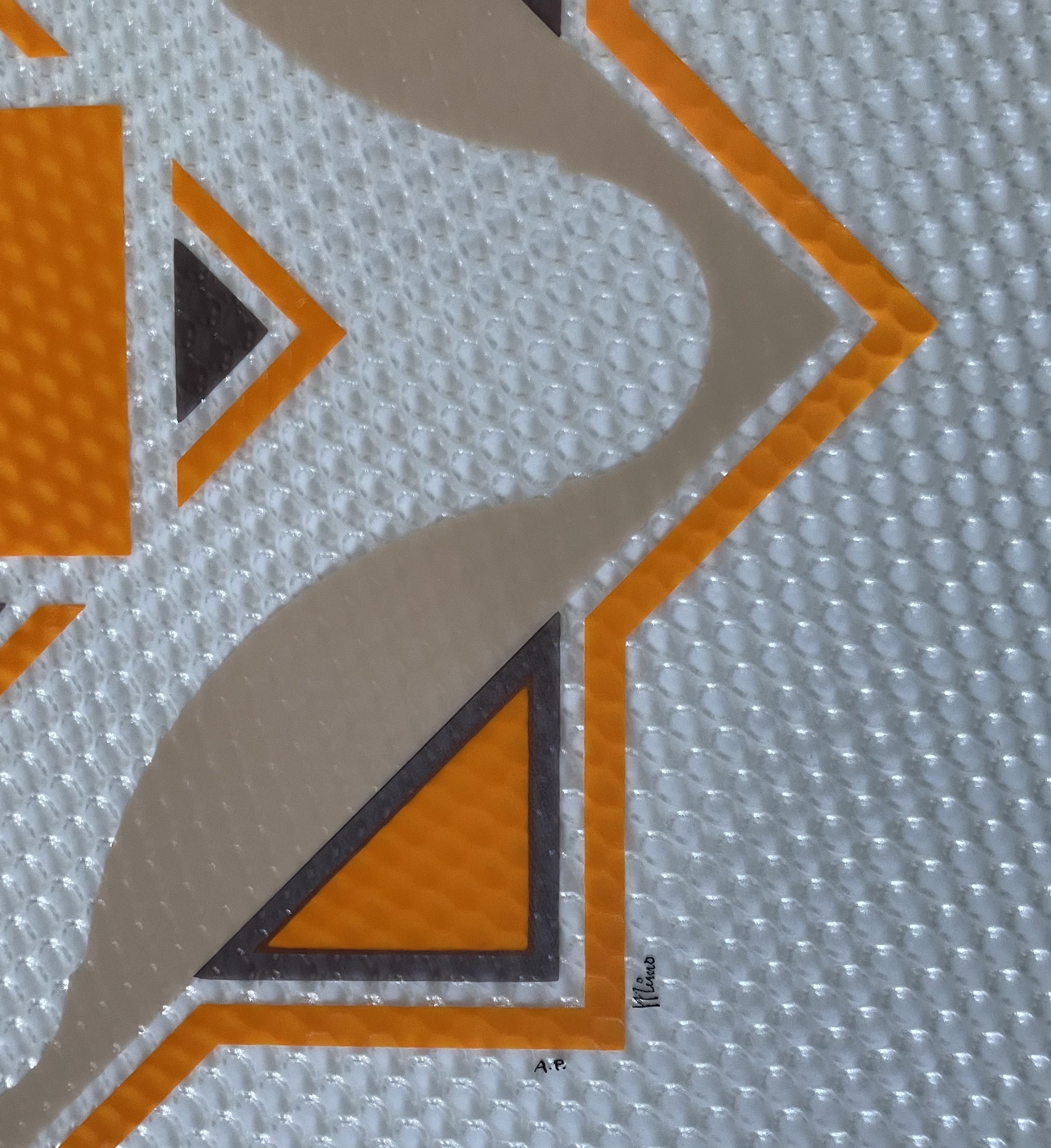
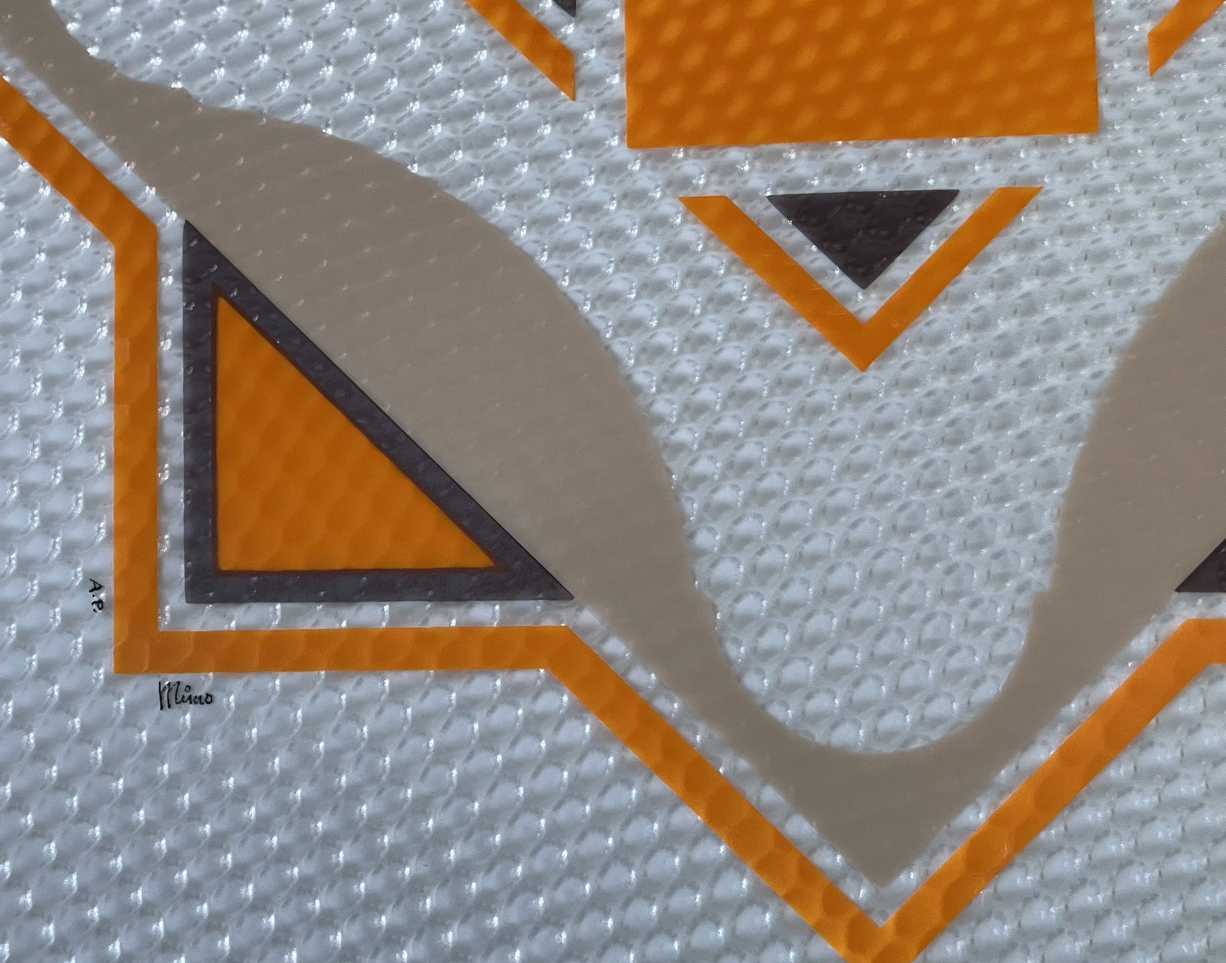
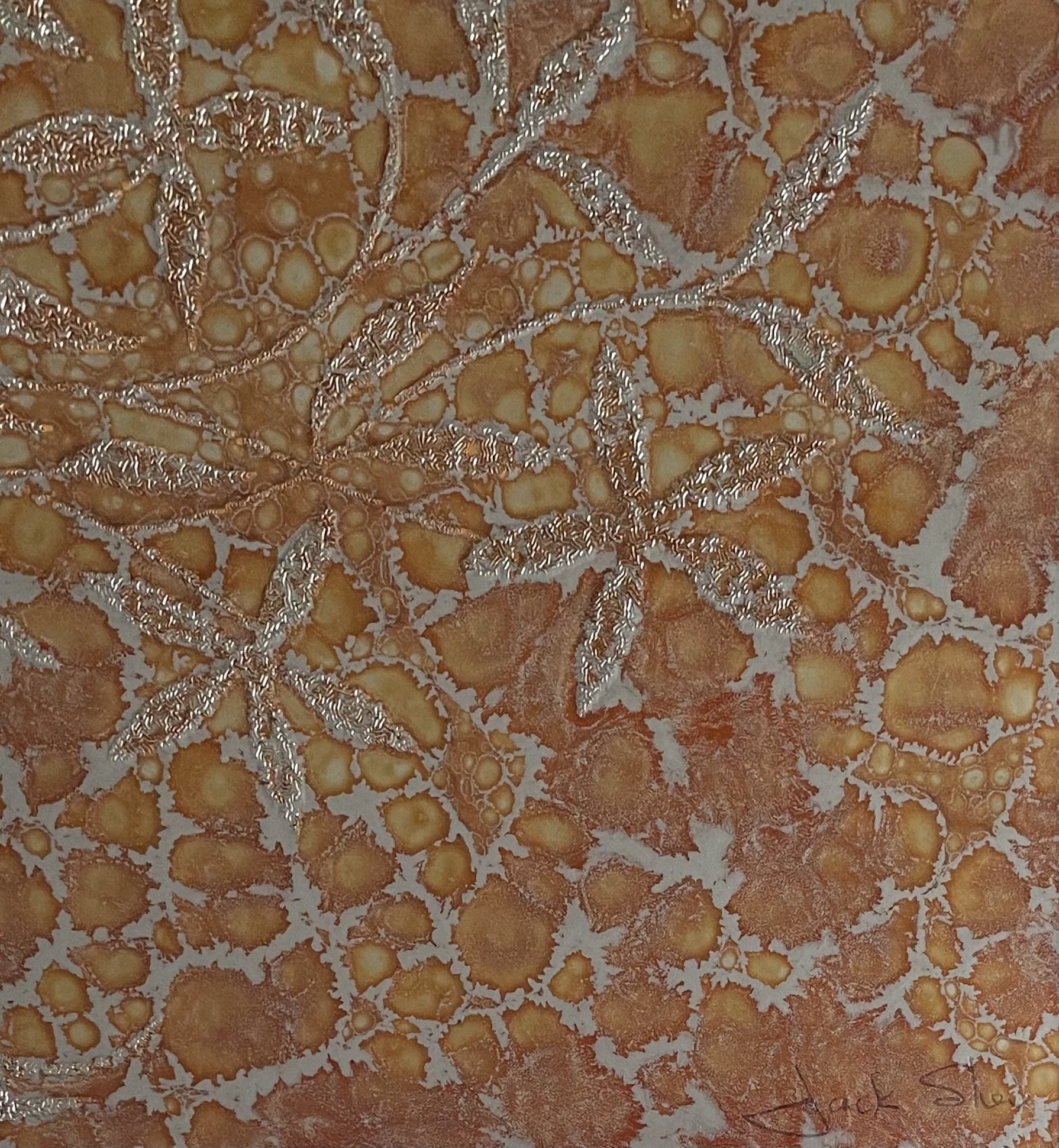
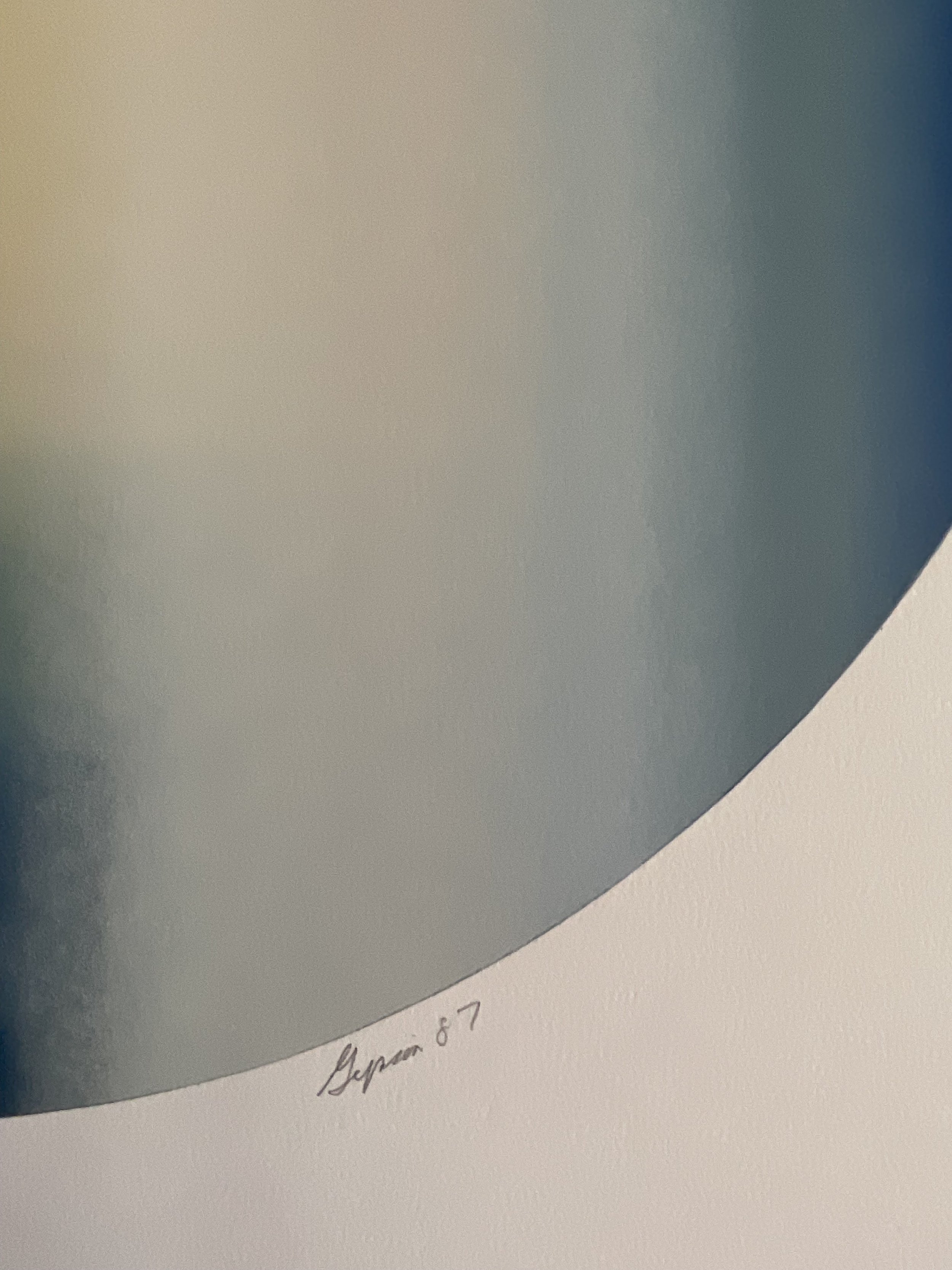
Executed as a serigraph (screenprint), the piece demonstrates precise registration and controlled layering of opaque inks, necessary to maintain crisp edges and strong color separation on a reflective surface. The work is signed “Mimo” and marked A.P. (Artist’s Proof), indicating a proof impression aside from the numbered edition and typically reserved for the artist or publisher.
Stylistically, the work aligns with hard-edge abstraction and Op Art–influenced modernism, echoing the period’s fascination with symmetry, optical vibration, and the fusion of fine art with interior design. It was clearly conceived not only as a graphic statement but as an object meant to perform within architectural space.
Mimo (active c. 1970s) is an abstract printmaker whose work is known today primarily through surviving limited-edition serigraphs produced during the height of modernist and Op Art–influenced design in the late 20th century. While comprehensive biographical documentation is limited, Mimo’s prints reflect a professional, studio-based practice and a sophisticated engagement with geometry, material innovation, and optical perception.
Working during a period when serigraphy was embraced by artists, publishers, and designers alike, Mimo developed a visual language rooted in hard-edge abstraction—clean lines, symmetry, and carefully balanced forms—combined with experimental substrates. His use of textured prismatic vinyl situates his work within a broader 1970s movement that blurred the boundaries between fine art, industrial design, and architectural décor.
Mimo’s creative process appears methodical and exacting. Compositions were likely developed through measured planning and template-based design to ensure precise alignment across multiple screens. Printing on vinyl requires careful ink selection and pressure control, suggesting technical fluency and access to a professional print workshop. Rather than relying on illusionistic depth, Mimo activated the surface itself, allowing light to become an integral component of the artwork.
Although Mimo is not yet widely represented in major museum collections or standard reference texts, his work was clearly produced for a serious market of collectors, architects, and interior designers who valued bold, modern aesthetics. The presence of Artist’s Proofs, consistent signatures, and durable materials supports the conclusion that his work circulated through established galleries and publishers during the era.
For contemporary collectors, Mimo’s prints offer an authentic, materially distinctive example of 1970s geometric abstraction—objects that embody the decade’s optimism for design, technology, and visual clarity.
Mimo (active c. 1970s), Untitled (Geometric Prismatic), serigraph on prismatic vinyl, 24 × 24 in, Artist’s Proof (A.P.), signed “Mimo.” A bold hard-edge geometric abstraction with optical surface effects. Provenance: Mitch Morse Gallery (NYC/Europe) to Artfind Gallery, Washington, DC.
Certificate of Authenticity & Estimated Value
Artist: Mimo (active c. 1970s)
Title: Untitled (Geometric Prismatic) (attributed)
Date: c. 1970s
Medium: Serigraph on textured prismatic vinyl
Dimensions: 24 × 24 inches
Edition: Artist’s Proof (A.P.)
Markings: Signed “Mimo”; marked A.P.
Provenance:
Mimo (artist) → Mitch Morse Gallery (New York, NY; works sourced NYC and Europe) → Artfind Gallery, Washington DC (current owner)
Mimo (artist) → Mitch Morse Gallery, New York (inventory sourced NYC & Europe) → Artfind Gallery, Washington DC
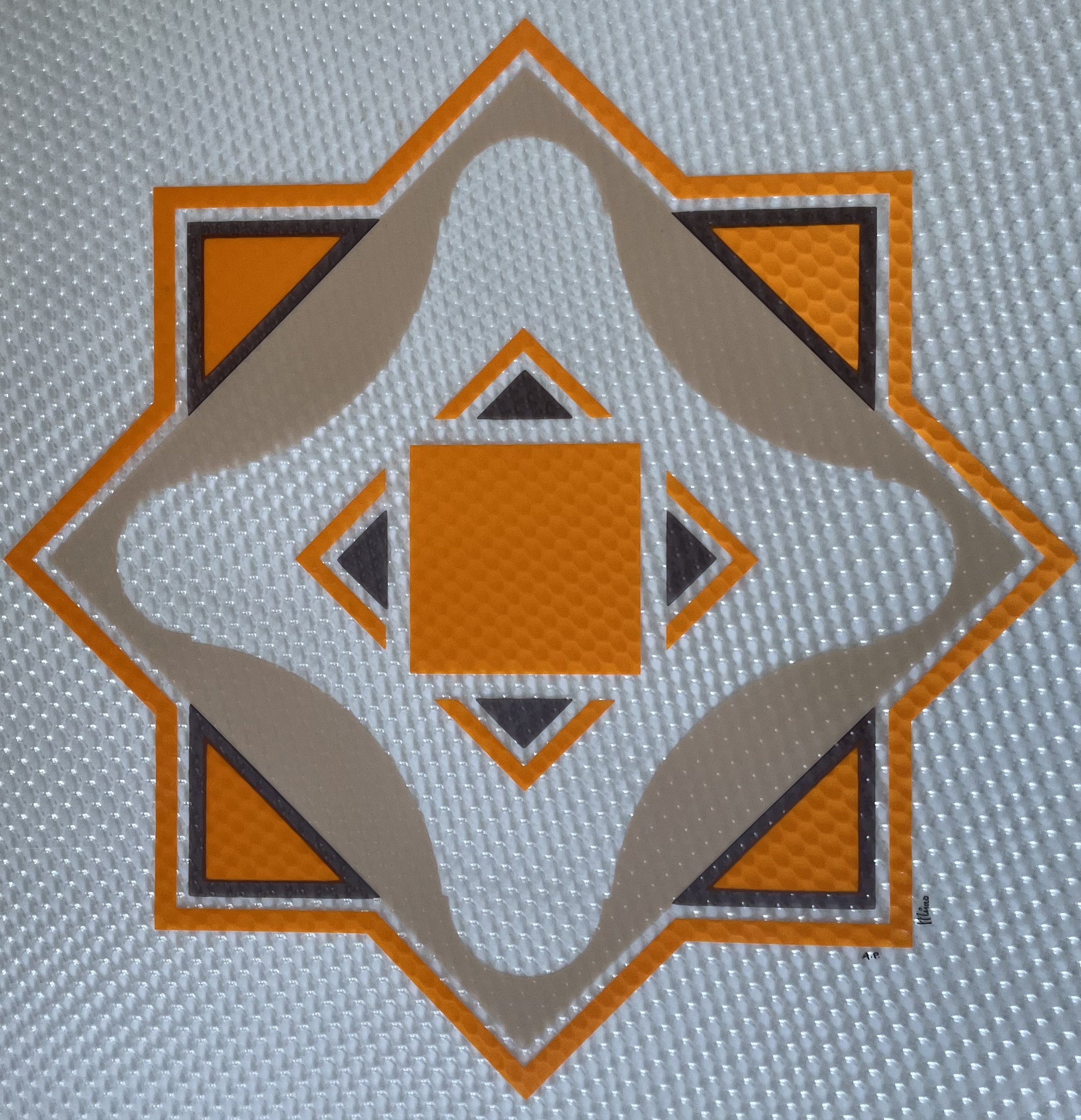
A rare 1970s geometric serigraph by Mimo, screen-printed on textured prismatic vinyl. This Artist’s Proof (A.P.) combines hard-edge abstraction, Op Art precision, and reflective optical surface effects, making it a striking example of modernist decorative printmaking from the era.
This visually arresting geometric abstraction is structured around a symmetrical, diamond-oriented framework. A central orange square anchors the composition, surrounded by four dark triangular forms that point inward, while sweeping gray arcs create a dynamic rotational rhythm. These elements are contained within layered angular borders rendered in orange, charcoal, and silver-gray, emphasizing balance, order, and architectural clarity.
The defining feature of the work is its prismatic vinyl substrate—a textured, light-reactive surface that refracts and scatters light. As the viewer moves, the background shifts subtly in tone and brightness, activating the composition and giving the otherwise flat geometry a kinetic, dimensional quality. This interaction between ink and industrial material places the work squarely within the experimental spirit of 1970s printmaking, when artists increasingly explored nontraditional supports.
Executed as a serigraph (screenprint), the piece demonstrates precise registration and controlled layering of opaque inks, necessary to maintain crisp edges and strong color separation on a reflective surface. The work is signed “Mimo” and marked A.P. (Artist’s Proof), indicating a proof impression aside from the numbered edition and typically reserved for the artist or publisher.
Stylistically, the work aligns with hard-edge abstraction and Op Art–influenced modernism, echoing the period’s fascination with symmetry, optical vibration, and the fusion of fine art with interior design. It was clearly conceived not only as a graphic statement but as an object meant to perform within architectural space.
Mimo (active c. 1970s) is an abstract printmaker whose work is known today primarily through surviving limited-edition serigraphs produced during the height of modernist and Op Art–influenced design in the late 20th century. While comprehensive biographical documentation is limited, Mimo’s prints reflect a professional, studio-based practice and a sophisticated engagement with geometry, material innovation, and optical perception.
Working during a period when serigraphy was embraced by artists, publishers, and designers alike, Mimo developed a visual language rooted in hard-edge abstraction—clean lines, symmetry, and carefully balanced forms—combined with experimental substrates. His use of textured prismatic vinyl situates his work within a broader 1970s movement that blurred the boundaries between fine art, industrial design, and architectural décor.
Mimo’s creative process appears methodical and exacting. Compositions were likely developed through measured planning and template-based design to ensure precise alignment across multiple screens. Printing on vinyl requires careful ink selection and pressure control, suggesting technical fluency and access to a professional print workshop. Rather than relying on illusionistic depth, Mimo activated the surface itself, allowing light to become an integral component of the artwork.
Although Mimo is not yet widely represented in major museum collections or standard reference texts, his work was clearly produced for a serious market of collectors, architects, and interior designers who valued bold, modern aesthetics. The presence of Artist’s Proofs, consistent signatures, and durable materials supports the conclusion that his work circulated through established galleries and publishers during the era.
For contemporary collectors, Mimo’s prints offer an authentic, materially distinctive example of 1970s geometric abstraction—objects that embody the decade’s optimism for design, technology, and visual clarity.
Mimo (active c. 1970s), Untitled (Geometric Prismatic), serigraph on prismatic vinyl, 24 × 24 in, Artist’s Proof (A.P.), signed “Mimo.” A bold hard-edge geometric abstraction with optical surface effects. Provenance: Mitch Morse Gallery (NYC/Europe) to Artfind Gallery, Washington, DC.
Certificate of Authenticity & Estimated Value
Artist: Mimo (active c. 1970s)
Title: Untitled (Geometric Prismatic) (attributed)
Date: c. 1970s
Medium: Serigraph on textured prismatic vinyl
Dimensions: 24 × 24 inches
Edition: Artist’s Proof (A.P.)
Markings: Signed “Mimo”; marked A.P.
Provenance:
Mimo (artist) → Mitch Morse Gallery (New York, NY; works sourced NYC and Europe) → Artfind Gallery, Washington DC (current owner)
Mimo (artist) → Mitch Morse Gallery, New York (inventory sourced NYC & Europe) → Artfind Gallery, Washington DC